Index Comparison Chart: Benchmark Your Trading Edge
Stop comparing yourself to other traders. The Index Comparison Chart lets you measure your performance against the S&P 500 (SPY) on your terms. See your daily or weekly returns side-by-side with the market�s most-watched benchmark, and track your true trading edge over time.
This tool is designed for traders who want to know: �Am I beating the market?� Upload your individual trade files at the end of each day for the most accurate results�your account balance is tracked for each date, so you get a true apples-to-apples comparison. If you upload a range of trade activity, the tool will estimate your performance based on available account balance data.
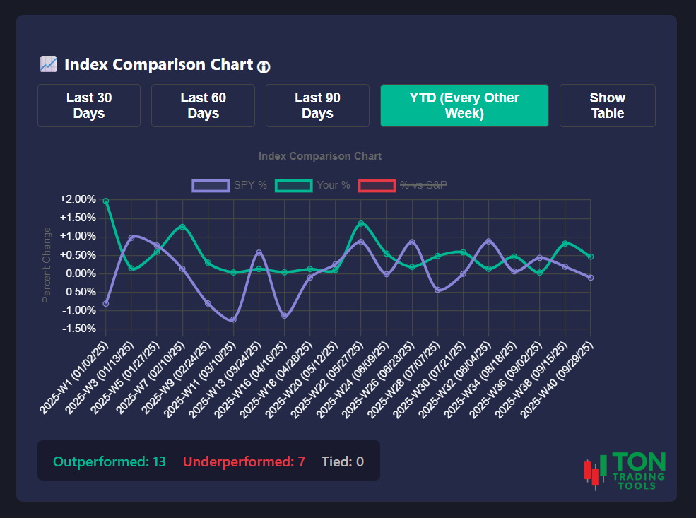
Toggle between 30, 60, 90 days, or year-to-date (YTD) to spot trends, streaks, and outliers. Instantly see how often you outperformed or underperformed the S&P 500, and review your results in both chart and table format. No more guessing�get the context you need to improve your process.
Key Benefits
Personalized Benchmarking
- Compare your daily or weekly returns to the S&P 500 (SPY)
- See your true edge�no more comparing to other traders
- Track your performance over any period: 30, 60, 90 days, or YTD
- Spot outperformance and underperformance at a glance
Accurate, Account-Based Results
- Upload daily trade files for precise, date-based account tracking
- Estimates available for users with only a date range of trade activity
- Chart uses SPY as the S&P 500 benchmark for accuracy
- Review both chart and sortable table views
Actionable, Simple Reporting
- Color-coded chart for instant clarity
- See percent outperformance/underperformance for every period
- Export or screenshot your results for your journal or tax prep
- Perfect for end-of-month or end-of-quarter reviews
Designed for Real Traders
- Responsive design for desktop and mobile
- Integrates with your trading journal and reporting tools
- Built for day traders, swing traders, and investors alike
- Simple, intuitive interface�no learning curve
Why Benchmark Against the S&P 500?
Most platforms only show your raw P&L, but that�s not the whole story. The Index Comparison Chart puts your results in context�so you can see if your strategy is truly adding value, or if you�d be better off in the index. This is the only way to know if your trading process is working over time.
| What Brokers Show | What Our Chart Provides |
|---|---|
| Raw P&L or account value | Performance vs. S&P 500 (SPY) for every day or week |
| No context for your results | See outperformance/underperformance at a glance |
| Manual spreadsheet work | Automated, visual reporting with flexible date ranges |
| Hard to track your edge | Personalized benchmarking and trend spotting |
Advanced Features
The Index Comparison Chart is more than just a summary�it�s a tool for real improvement:
- Toggle between daily and weekly performance
- Flexible date ranges: 30, 60, 90 days, or YTD
- Color-coded chart and table for fast review
- Export-ready for your records or tax prep
- Integrates with your trading journal and other reporting tools
Get Started Today
Stop guessing about your trading edge. The Index Comparison Chart gives you the context you need to make better decisions, improve your process, and achieve your trading goals. Contact us to see how this simple tool can transform your review process.
FAQ
Frequently Asked Questions
Answers to common questions about the Index Comparison Chart.

It�s a reporting tool that lets you compare your daily or weekly returns to the S&P 500 (SPY), so you can track your true trading edge over time.
Upload your individual trade files at the end of each day. This allows the tool to track your account balance for each date, giving you a true apples-to-apples comparison with the S&P 500.
Yes, the tool will estimate your performance based on the available account balance data for your date range.
Absolutely. Instantly toggle between a color-coded chart and a sortable table for a complete review of your performance.